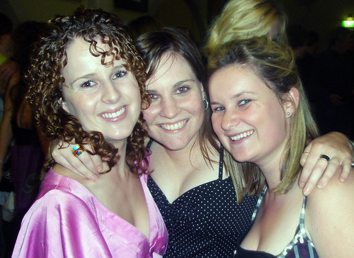
In Flickr I have uploaded more than 30 photos which included photos of my friends, images of my uni work that I have completed during first semester and screenshots of examples to show good aesthetics in websites. The website I found most aesthetically pleasing is a Melbourne based design studio called Gazel as text was easy to read, simple layout, theme continued when going to following pages and the graphic on the side was a nice finish with the sun rays slowly moving around. All images have been put into 3 sets which I think is a tidy way of organising things, it also makes it easier to find something in particular you may be looking for. All of my images have titles, descriptions and tags. Appropriate images have a MPI104-2007 tag which may be interesting to classmates, inappropriate images for this tag have been tagged with other names. I have pushed more than 6 people into the MPI104-2007 group, have more than 12 contacts and have joined at least 3 groups. I have nominated more than 6 favourites. I saved photographs and student work. I found this work to be very aesthetically pleasing.
Del.icio.us was harder to make more aesthetically pleasing than blogger and flickr. It has a simple, easy to read layout which I guess makes it aesthically pleasing. I think the thing that makes it most aestheticallly pleasing is having all labels in bundles instead of just having them in one long list which is what I have done. Theres also the option of minising the bundles so the tags are hidden if you want a more tidy look. My account has more than 3 pages of bookmarks which all have descriptions and tags. Bookmarks that may be interest to other classmates have been tagged MPI104-2007 and those that have no interest to MPI104-2007 students have been tagged appropriately. I have several other del.icio.us users in my network and have saved links for some of them using "for" tags.
In my blogger account I have more than the minimum posts which all have working links in them, I have experimented with templates, fonts and colours. I have changed my template since the last assessment. I find this one to be easy to read and use. I have left the back of posts white ensuring text is easy to read, my titles of posts are purple which makes them stand out a bit more and also match the header. My blog achieve, about me, links etc have been put down the right hand side making my blog easy to use and easy to find anything. I have added images that match my text into my posts to make my blog more aesthetically pleasing. A posts to show this is my magazine cover. My post on aesthetics includes a description and a site that I find aesthetically pleasing and the reasons why and one that I dont. I have included a RSS feed of my del.icio.us bookmarks and a "fave this blog" button on my blog. The MPI104 Metablog has been saved as one of my technorati favourites, as well as my classmates. My blog now has a sitemeter counter and includes a post about the vistors to my blog, as well as an updated post about my vistors.
Subscribe to:
Post Comments (Atom)


No comments:
Post a Comment